Illustration Work
One of the main reasons I’ve always been drawn to both visual arts and literature is that they have an undeniable natural synergy. Both mediums have an incredible capacity to weave stories, and working in tandem they breathe so much life into each other. Being able to collaborate with authors to portray their characters and the spaces they inhabit through my artwork is an undertaking I’ve found to be deeply rewarding. Click the covers if you’d like to learn more or show some love to these talented authors!
(Coming soon!)


Portfolio

Excerpts from Curtis Cootie: A Day in the Life of a Cootie (2025)
The story oscillates between interrogation scenes from within the hosts’ body (featuring solely germs and cells) and real world depictions of the main characters at home and at school. I wanted to create a clear contrast between how the two settings were rendered. The outside world is a bit lower contrast with more soft shading. It features more grounded and natural colors.
This is the first two page spread of the book, featuring movement and perspective that pulls the eye through the story and across the pages chronologically.


This story follows a little germ and his misadventures as he gets passed from one unsuspecting host to the next. From my initial read of the manuscript, I knew I wanted to adopt a film noir-esque comic book style approach.
On the left is my initial concept renderings of the titular character, where I played around with heavy cell shading, colorful rim lights, and crosshatching (which I eventually decided against for the sake of streamlining the process).
On the right you can see the implementation of these methods in a final render.
Excerpts from Ali Kazoo and Millie Moo Too! (2022)


Here is another spread, with the initial sketch shown to demonstrate how I thumbnail to determine the balance of the page and dialogue.
A few design notes on the final render: the blue molecular man is meant to be representative of mRNA and hence has the role of a postman (just as the red and white blood cells function as detectives in this story). There is also a subtle nod to Edvard Munch’s “The Scream.”

Similarly to Ringo Flamingo, I used background “sets,” which allowed me to invest a lot of time and detail into each individual background, seeing as they would be reused in various positions and crops throughout the story. This was particularly relevant in the cluttered house scene, whereupon there was a hidden object the characters had to search for that I did not want to be immediately obvious to the reader!

One thing I pride myself in within my illustration work is attention to detail. I like to “reward” the most attentive eyes with little Easter eggs so to speak. For instance, in the page to the left I went so far as to look up the length of the average nasal cavity (4-8 cm) and included it within the signage for a tiny bit of added realism.
The comic book Roger is reading also happens to feature the main characters from the first book I illustrated for this same author (Ali Kazoo and Millie Moo Too!), color dropped directly from the original artwork.
I think this sort of thing adds reread value to the story (to scan for any little details that were missed at first glance) as well as a bit of extra magic and character.
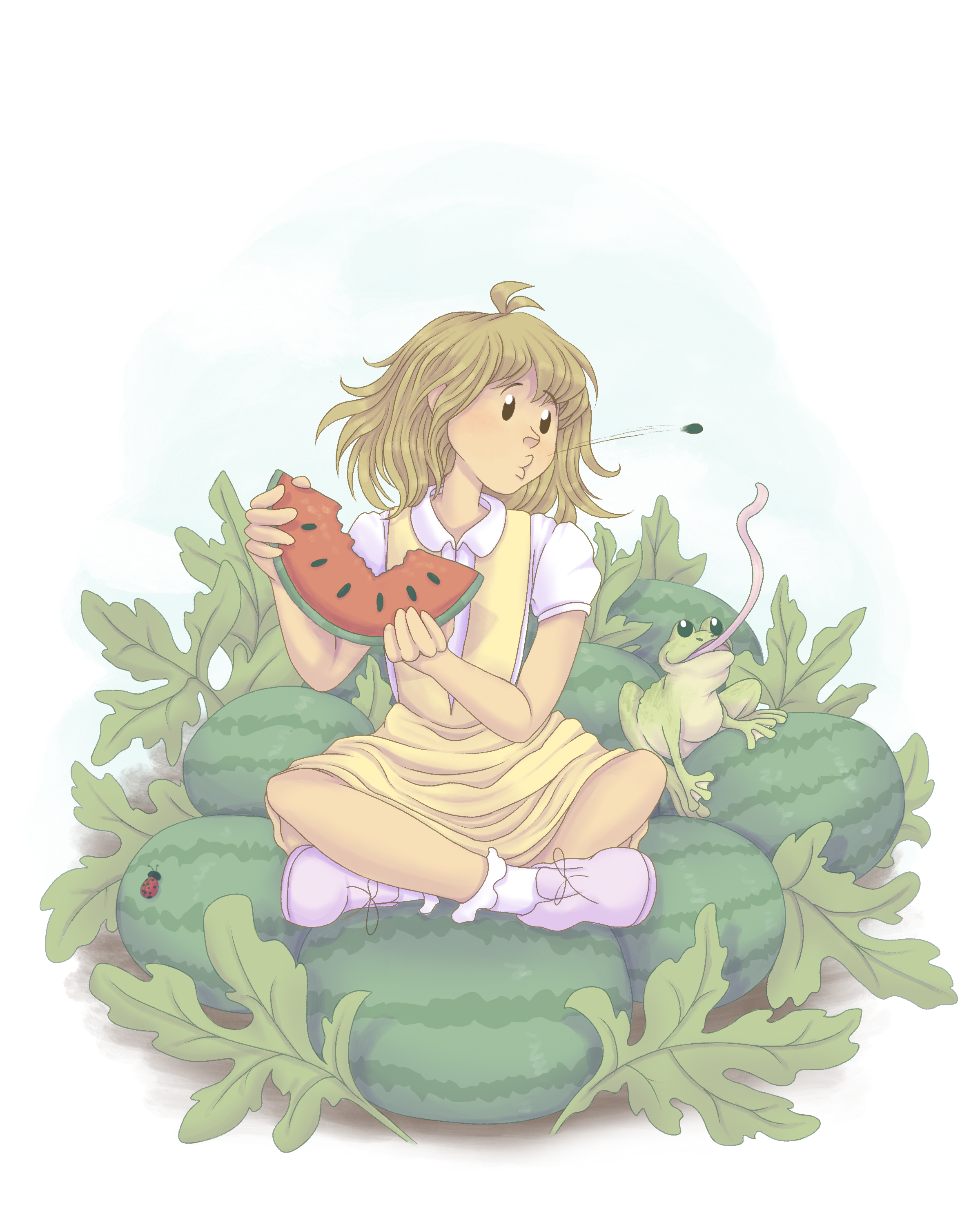
In this story, the setting itself is very much a character. It is meant to be seen as a safe space for the characters and the reader. I wanted to include scenes like this atmospheric spread to emphasize the characteristics of the meadow: quietude, serenity, and room for endless possibilities.

Excerpts from Ringo Flamingo (2022)

Excerpts from The Meadow (2024)

The Meadow is what I would consider a story about quiet confidence. I wanted to use a soft, pastel color palette and a textured, painterly approach to the rendering to reflect that. Pictured above is the first concept render I presented to the author in the planning stages.
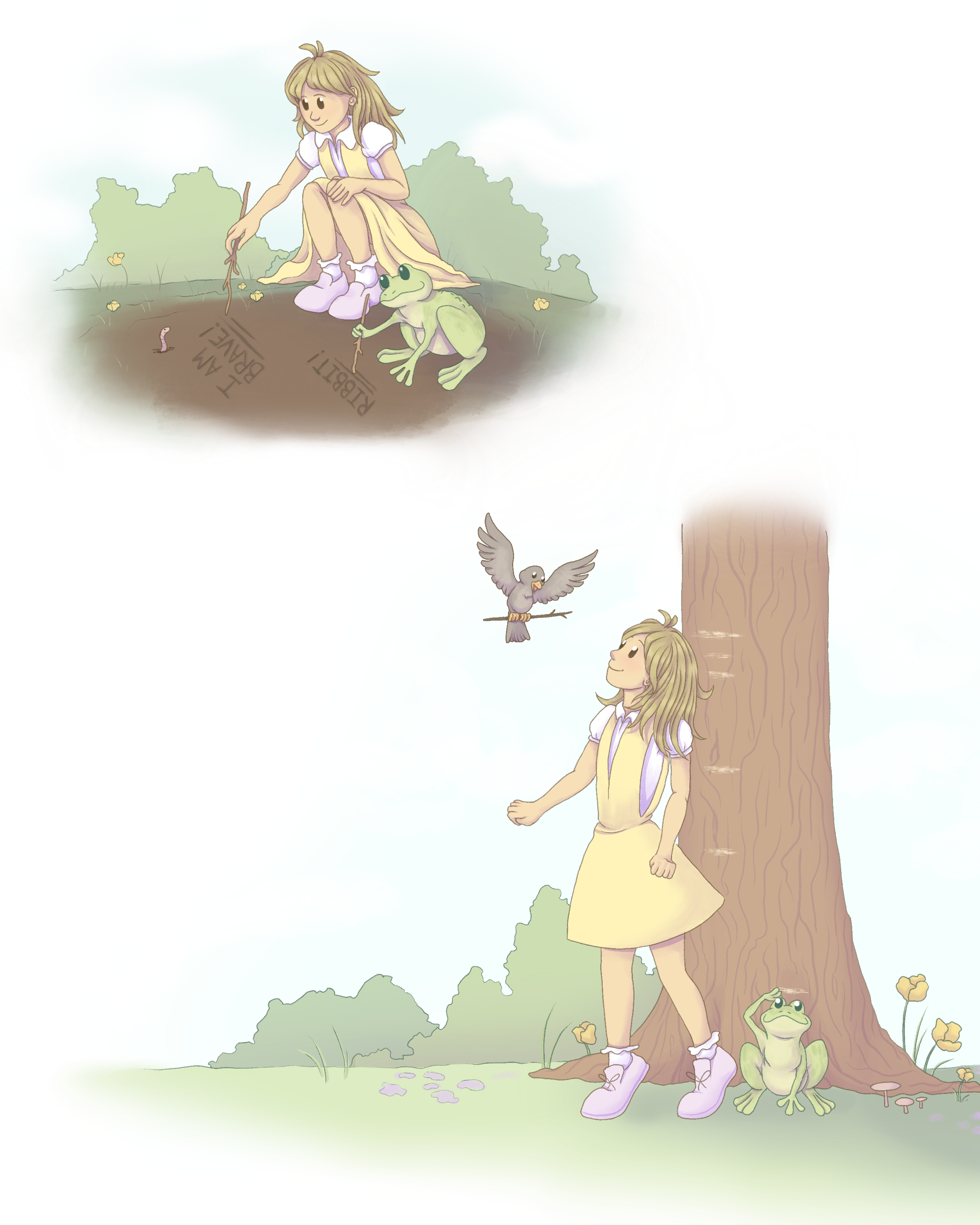
The story is based more around the concept of imaginative play and whimsy as opposed to having a strictly sequential plot, so I opted to style the illustrations as separate vignettes.
On pretty much every page there are little woodland animal cameos for the discerning eye.

With Ringo Flamingo, the author and I agreed to do predominantly flat color (minimal to no shading) with a set amount of painted backgrounds. With that in mind, I knew establishing clear values would be essential in making sure all of the colors read correctly and that the characters stood out appropriately. Another challenge I had to address was how to frame these compositions so that two characters with a huge size disparity still got equal emphasis on the page.
I began the planning stage by making these quick value keys as thumbnails. Additionally, I tried to come up with creative ways to reuse the background sets without it looking too repetitive by utilizing strategic zooms and crops. This allowed for us to save on time and budget while still creating an immersive experience.


My first foray into illustrating children’s literature was actually the second book in a series—I picked up the project as the original illustrator was unavailable. I had the challenge of trying to create a consistent follow up that was stylistically similar in its approach.
While Ali (the character in blue) was designed by the original illustrator, I designed Millie (the character in red) as a complement to her. Millie by comparison is stocky and short, with volume in her lower half from her sleeves, overalls, and boots.

